Table of contents

Do you want to increase sales and build even better relationships with your customers?
If you were to ask randomly encountered people what is a pop up, the most common response (of course other than „Pop up? Never heard of it”) would be: „It’s an annoying popping up window”. Exactly.
You would think that exit pop ups are just like intrusive flies circling around our head – i.e. that they irritate everyone. But is that really the case? Does every user have to feel irritation at the very sight of a popping up notification box? We will try to convince you, that a well-designed pop up provides great benefits. It turns out that exit pop-ups are one of the most effective functionalities enabling us to keep customers on our website, and consequently, increasing their involvement and attachment to the brand.
What is all that for? A few words about using exit-pop ups properly
You need more leads. Especially ones that are qualified and involved in the life of your brand, is that correct? We will now offer you a seemingly controversial solution: the exit pop up. Why is that? Because a well-designed exit pop up can bring about an increase in leads of up to 600% (and sometimes even more). You have to admit, that’s a pretty impressive result. Let’s say that your business generates a hundred new leads weekly – a simple pop-up could increase this number to six hundred per week. That’s five hundred potential customers more every week!
Let’s start from the beginning. An exit pop up is displayed when the user is planning to leave the site (i.e. they are directing their cursor outside the browser page area – e.g. towards the „x” close button). It is a typical message based on „exit tracking” software which evaluates the amount of time after which the visitor plans to leave the site. A well-designed pop-up is supposed to encourage the user to stay on the site or to move to another site within the same domain (or sub-domain). To put it simply – the point is for the user not to go to the website of the competitors. It is worth to encourage them to stay with us, for example by placing a catchy CTA (call to action).
Imagine that the readers of your blog consume valuable content that you offer – focusing specifically on the content that interests them. They are not looking for content in other areas of the website – they are reading and not buying. This does not mean that they are not interested in your product, or your content, or the recommendations that you include on your site. This simply means, that they are focused on something else, when you give them that opportunity.
What should we keep in mind when designing pop-up messages?
- place a link to the landing page or a page containing the leads in your message
- place different pop ups on each page – a pop-up with a discount for shopping doesn’t fit all of them, just like you wouldn’t place information about a free ebook download on every page
- make sure that you are not spamming your users. Do not set the exit pop-up to be displayed every time a user visits your website – it can be really irritating. A pop up sent once a week is the most efficient
- an A/B test will be a good idea – it will enable you to check what type of message is more effective
- make sure that the user sees the other valuable content that you place on your website, or the products that you offer. Such a pop-up is supposed to redirect the reader to the appropriate page.
What should a well-designed exit pop up look like?
If you use exit pop ups wisely, they can be really effective. However, this requires a good knowledge of your customers, in order to know which group should be the target of your message. You can also try several versions, in order to determine which of your campaigns has the best conversion rate.
- design you messages wisely, you have a lot of options, you can use graphics, catchy copy or a link
- the CTA should be located in a place where the user’s gaze will be focused for the longest time
- the text cannot be monotonous and repetitive – the main message or commercial offer should be immediately visible. Use different size fonts or highlight the text in order to emphasize the CTA
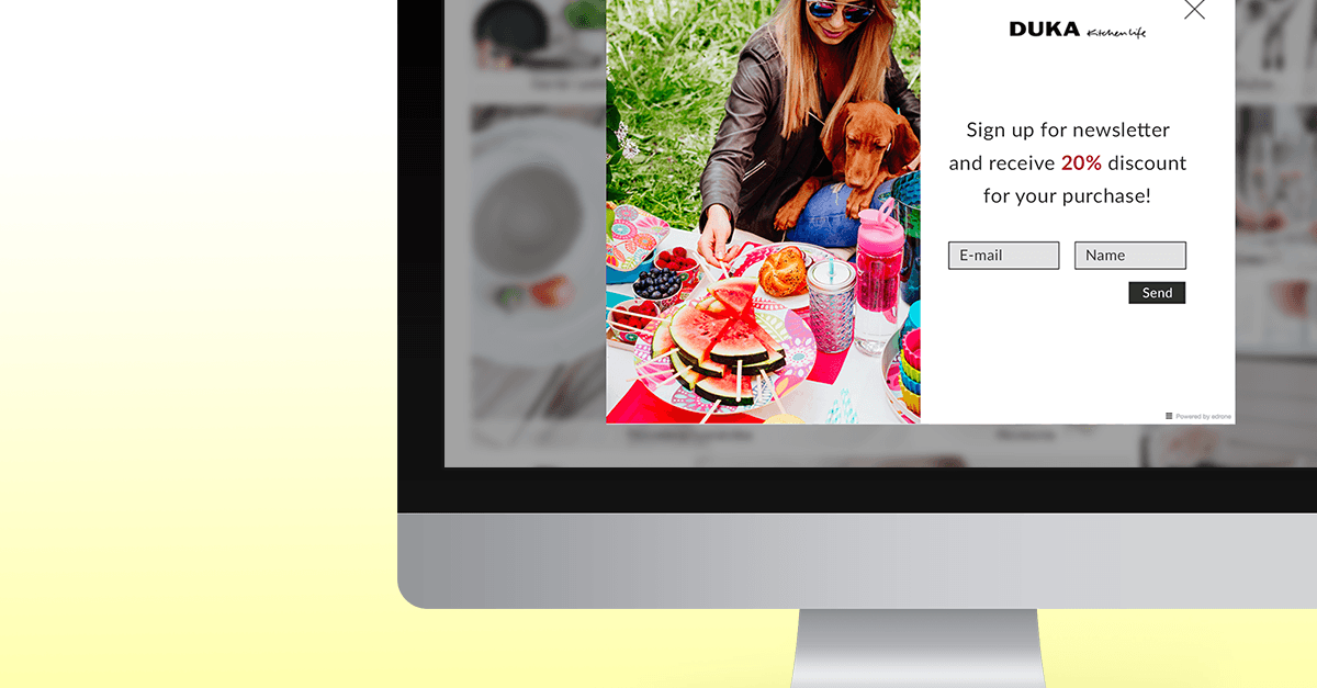
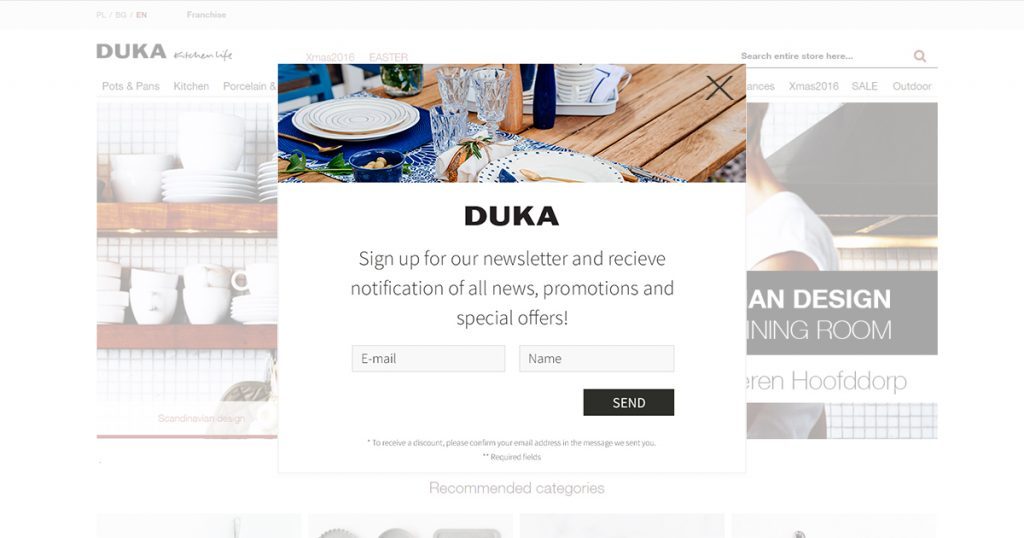
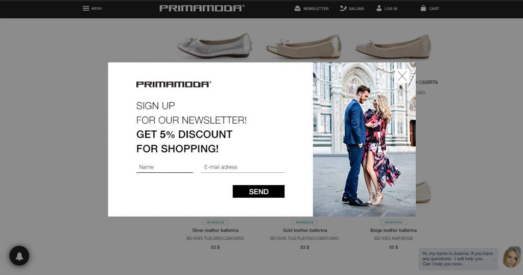
- the photograph that is used has to be well matched to the content of the message
- the creation should be legible and clear, with a large CTA button
What is the reason for the effectiveness of exit pop ups? Each customer is presented with the possibility of conversion – this could be the purchase of complementary goods, or information about the possibility of signing up for a personalized newsletter. Many stores include such information on their sites, but they can often be overlooked. When we add such an exit pop up to our site, our conversion rate increases by as much as 4%. This figure may not sound particularly impressive on its own, but it becomes more appealing, if we take into account the overall number of visits on the website. The ability to display attractive content at a time when the user is planning to leave the website is a good way to draw their attention and to keep it for longer.
Best practices when using exit pop ups:
- help the customer make a decision. Show them your most popular products. People are herd animals by nature, so they often follow the crowd – if so many people bought a given product, it means that it must be worth it.
- show photos instead of text. The human brain processes images 60 000 times faster than text
- check your profile at Google Analytics in order to learn about your bounce rate. Learn why customers are leaving your website and use that knowledge to design a more effective message.
An excessive bounce rate is one of the greatest issues that has to be dealt with by those who want to keep users on their website. As soon as a user leaves your website, the only thing you can do is to wait until they voluntarily come back. But why wait when you can use exit pop-ups? And after all you want them to come back, right? Especially since a single visit to the website is not enough to ensure conversion.
How does it work in edrone?
Using the exit pop-up scenario in edrone you can determine how often you want the message to appear on the screen of the user’s computer (or mobile device). Remember not to overdo it with the frequency of the notifications – because in such case you may discourage the reader, instead of encouraging them to remain on the website, make purchases, or sign up for a newsletter. Nobody likes it when such messages are displayed all the time (especially if they have the same content). The website stores the user’s cookie files and knows when to display such a pop-up. This allows us to avoid a situation where the user gets irritated, because the same pop up was displayed once again.
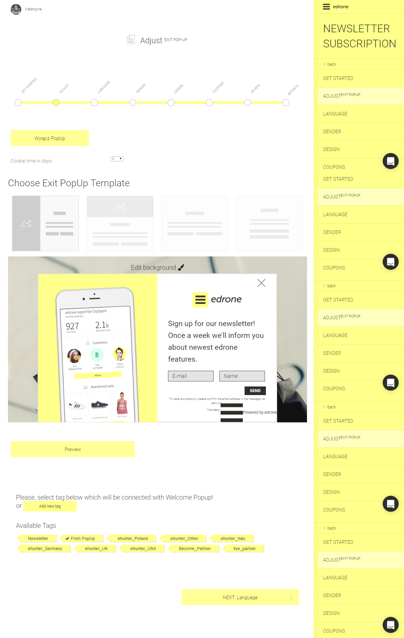
The implementation of an exit pop up scenario in edrone is easy and intuitive. The appearance of the pop-up is created in a drag & drop wizard. You just have to choose the graphic elements that match your concept of the customer (and their visual identification) from the menu, insert the appropriate text, select the photos and it’s done!

edrone
CRM, Marketing Automation and Voice Commerce for online stores. All in one.
Do you want to increase sales and build even better relationships with your customers?