Table of contents
Do you want to increase sales and build even better relationships with your customers?
We have briefly described the true meaning of on-site marketing recently. That was the theory, but still, it’s good to turn it into practice, isn’t it? To the point! In the following article, we’ll lean over use-cases and decide which on-site option will be the best for them. Let’s do it!
The following text represents theory turned into practice. It’s good for you to get acknowledged with the previous part – just for making sure we are on the same page, but no worries. It’s not mandatory (but definitely worthy!)
To have a purpose
First of all – you need to identify your business need.
- TIP: Business need -> Marketing Activity. In this order.
Do not create a banner, just to have a banner because everyone has a banner. This mechanism is called the Cargo cult. Name etymology is quite interesting, but what is crucial that it’s a drastically common mistake while choosing marketing tactics.
- But we definitely have to promote this and that!
Fine, but no one said that it has to be promoted via Banner. Every marketing tool has its better and worse applications.
Case One: Slider — Subscription Magnet
- Need: Newsletters are a vital channel of communication for the computer branch. New subscription income is an evergreen business need.
- Customer value: IT equipment is rather expensive (even budget models). Therefore, discounts, even small ones, would be valuable for clients.
Clients are rarely willing to subscribe for newsletter, just like that. That’s why we gonna use a discount – let’s say, 5% – to trade for the lead.
Caution!
- Terms „subscribe” and „newsletter” sometimes affect the user with kind of information blindness – isn’t the first subscription request they receive. Keep in mind the target audience.
- A section containing these words will inevitably be auto-blurred by subconsciousness, considered as not relevant. Clients are about to buy some IT equipment, not subscribe to the newsletter.
- This is precisely where Slider comes in handy!
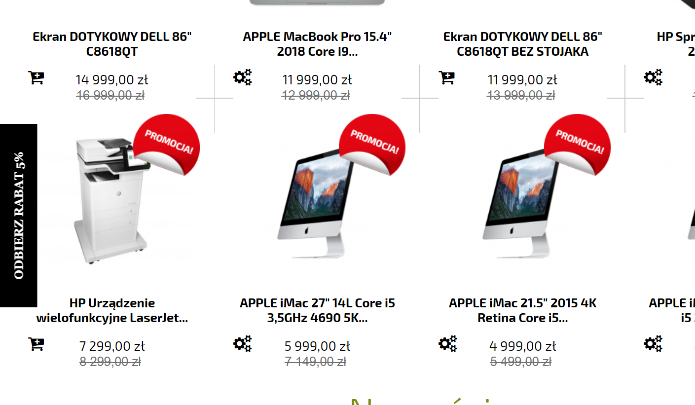
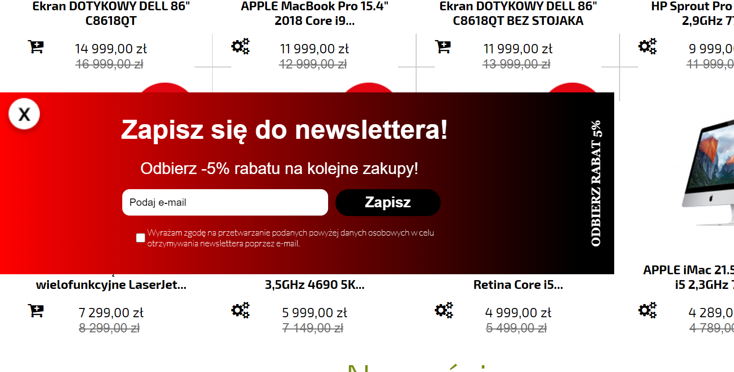
Slider hides behind the edge of the screen, showing just a small piece with a short copy. It’s an ideal place for inserting discount information. It’s catching attention, and then, upon the clicking, shows terms of granting cut for equipment.
Example:

Upon unfolding:

- “Receive a 5% discount!“
- “Subscribe to our newsletter and grab a 5% discount on the next purchase!”
Tip: Make sure that the left/right orientation fits your UI. In the given case, there is no menu on sides; therefore, the slider can be attached to both of them. However, it’s better to splice it into the right one since this is how we read: left -> right.
Case Two: Beam Stripper — Added Value
Stock isn’t just the number of products available. Sometimes it’s the number of products that – because of reasons – don’t want to go off the shop. If a big discount (even 70%) is not helping, it’s good to add them as a gratis in the sake of increase client value and enhancing conversion rate.
- Need: To get rid of old items stock; Conversion rate increase.
- Customer value: 2 for 1; Complementary product.
- For such promotional actions, unlimited by time – beam stripper is the best choice!
Caution!
- The product must be matched with other items in terms of needs. Random items for free, are no longer attractive for most of the clients, since balanced consumption of goods, and environment-friendly attitude, are widely desired.
- Whether your clients are paying attention to anti-consumerism or not; More the products relate to each other, the bigger added value is, and so the chance for conversion.
Example:
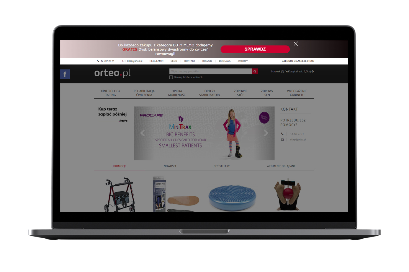
One of the edrone’s client prepared well-fitting beam stripper. There is no certainty that one of them was still on forced disposal; Still, it perfectly fits all the requirements. Orteo is eShop with rehabilitation and orthopedic equipment.

- “For every pair of MEMO shoes, you’re getting a free balance disc, helpful for home exercises. [Check out!]”
MEMO shoes are shoes helping the toddlers to learn to walk, and balance is an evident skill required for it. Worth to add – such disks are also wonderful toy 😉
Case Three: Overlay — Summer Sale
Holiday sale! Classics. The purpose is quite obvious. What more, clients are quite similar to such actions, and – more or less like during Black Friday sales, are browsing favorite shops in search for the occasion.
- Need: to fit hunters’ requirements, communicating anticipated promotion, but without distracting the attention of the regular ones.
- Customer value: Message „Hey! You’re in the right place.” send to customers.
- Actually, all of the banner types fill fit this case. Still, Overlay will be the best because of its semi-distracting features.

Social Proof — Better hurry!
Last, but not least! As we told in the previous article, on-site doesn’t have to focus only on actions to increase conversion rate. Social proof is also a thing.
Social Proof features
Similar to Web Layers, yet a bit different, considering its informative function. Web Layers are informative too, but you always want some action from the user to be taken – immediately.
Social Proof Features are more like „Just saying. You’re going to do what you want. But remember, time is ticking…”. They base on way more sophisticated mechanisms.
The following stats represent brick’ n’ mortar shopping experience, naturally unavailable due to the „online nature” of eCommerce. Still, presented data, are effecting subconsciousness, boosting conversion rate quite significantly.
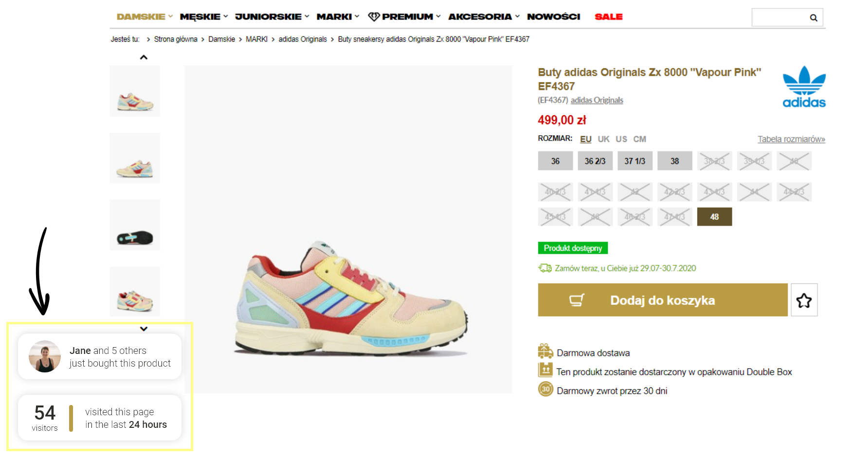
- Crowd density: Numbers of clients viewed product in a certain period (e.g., 24h)
- Stock drain: Number of clients that just purchased a particular item.
- FOMO Discount: Time left for promotion to end.
- Advice: Image with short copy, you want to include, as customer advisor („Hey! This product can be at you tomorrow!”).
Case Four: Social Proof — Hype generation
- Need: New premiere is an opportunity to generate hype and FOMO effect among the clients. A new, limited product is also slightly more expensive, so it’s important to underline that it sells like hot cakes.
- Customer value: That’s interesting…
Social proof doesn’t give the client any measurable value. It’s a strictly psychological effect, yet, it provides, or better say, enhance user experience. The client feels more satisfied with the purchase and values its „pray,” much more than regular item bought online.
Caution!
- It might be tempting to override this stats a bit. Sometimes it’s ok, but customers aren’t that naive. Exaggerated hype is quite easy to identify, and the effect might be completely opposite. You definitely don’t want this.
- Also, less is more. Social proof info might be „too much” if you apply it along with two banners, pop-up, and push-requests. Use it wisely!
Example:

Summing-up!
As you see. Every case has its own background. Always keep in mind the action that you expect from the user – in fact, it’s your ultimate guideline. But lets once again underline the most important rule of all. As long something is working – any other rule doesn’t apply! Your customers are final verification!
Marcin Lewek
Marketing Manager
edrone
Digital marketer and copywriter experienced and specialized in AI, design, and digital marketing itself. Science, and holistic approach enthusiast, after-hours musician, and sometimes actor. LinkedIn
Do you want to increase sales and build even better relationships with your customers?