Table of contents
- UX vs. Onsite Marketing?
- User Interface
- On-site content.
- It was supposed to be text about Marketing. Where are protips for banners!?
- HTML optimization & banners
- UX writing
- What is the difference between UX writing and copywriting?
- (Comprehensive) definitions.
- Word and Colour
- Joker’s Proving Ground
- Should I write only jokes?
- Social proof
- Design!
- Text and style
- Colors
- edrone color palette
- edrone primary colors:
- Effect:
- Summing Up

Do you want to increase sales and build even better relationships with your customers?
I would like to confess something. The following text was meant to be a click-bait-guide with protips for banners usage. However, while researching for it, I quickly faced the question: what on-site marketing really is? We all know it… do we?
Some sources say that on-site marketing is every action, you’re making to raise the chance for conversion. Speaking that, we should also include the whole of UX obviously, along with UI, as it is the part of UX practices. Well, it looks like on-site marketing is… webpage itself? With all of its content, structure, and design?
UX vs. Onsite Marketing?
The pleased client is happy, and happy people are usually more eager to perform actions that those who made them happy asked them for. That’s the key.
UX is specialization covering plenty of sub-specializations, aimed strictly into making users as happy as possible using all techniques available. Or better – making use of product, website, shop, as painless, as possible. Ergonomy, usefulness, satisfaction. Let’s say: smoothness.
Smoothness is an excellent word to describe user experience, since these two while considering on-site marketing, are basically the same. What I exactly mean saying smooth?
User Interface
A website that can provide conversion (not only in its’ purchase meaning) in a few clicks. Or better: To allow doing so in a split second since instant purchase sometimes is not exactly what you want. The number of clicks also doesn’t really matter. Of course, it is associated with time, although five clicks on a well-designed web page can be (and very often are) way much faster than finding one button on a terrible one.
Protip: Every piece of your website is, in fact, part of its UI. Every one of them! Please, keep it in mind, and let’s proceed!
On-site content.
This one is usually equated with content SEO covers all Search engine optimization actions, you perform directly effecting website traffic. Besides high-quality materials, containing as many keywords as possible (which is sometimes a terrible idea, when we focus too much on it, instead of quality itself), some specialists also include inside of it following actions:
- HTML optimization (tags, metatags, headlines)
- Information architecture (ontology/taxonomy)
- URL structure, but…
Protip: Please, I beg you. Substantive content will always win. Keywords and structure are essential things, but it usually comes automatically with quality 🙂
If you’re deep-diving in any topic, you will be automatically using various words, and among them probably all necessary keywords. The same is with structure. Weak content requires additional work with logical alignment and headlines hierarchy. Quality-content simply will have it because it wouldn’t be quality-content, while the opposite.
Most and foremost – you’re writing for people, not for robots. It’s funny that it has to be reminded, but necessary these days 😉
It was supposed to be text about Marketing. Where are protips for banners!?
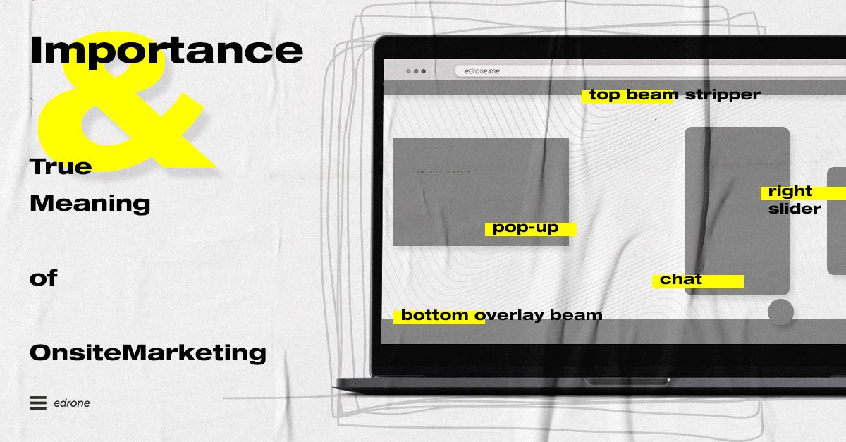
See! We even spoke about them yet! With banners in mind, we should always think about them in categories of UX/design/UI and psychology of marketing. Sorry, we have the year 2020. Blinking, popping, screaming windows, designed with no taste is no longer ok (never was).
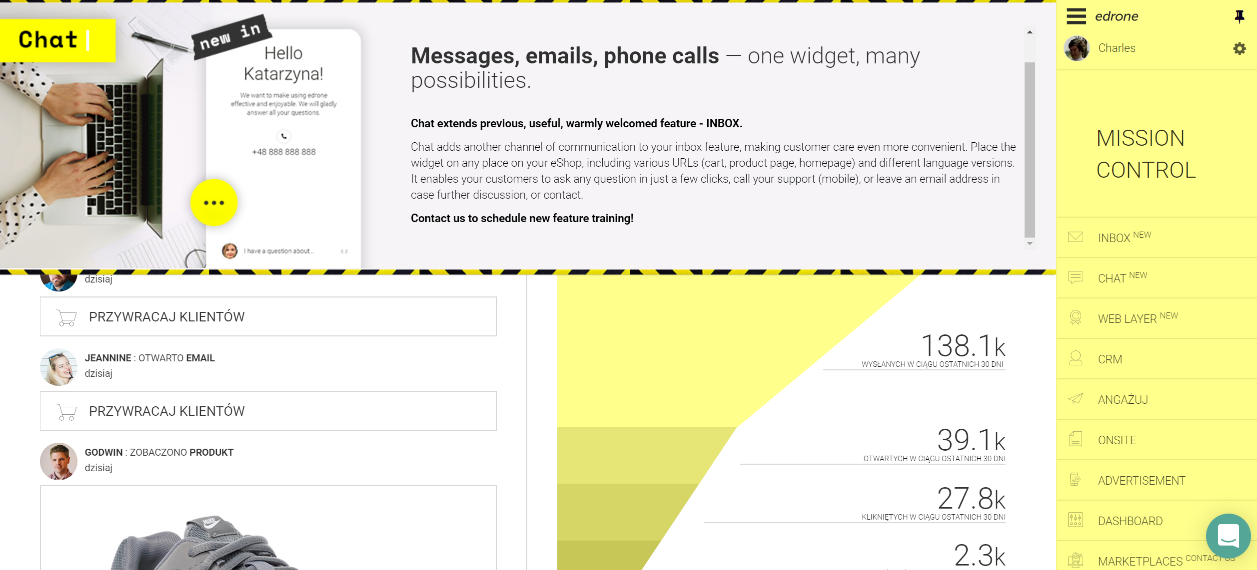
That’s why developing Web-Layers feature, we focused more than ever on personalizations/customizations options. In/Out animations, overlay, sliders, beam – one of them might be even used by only 10% of users, yet still, it is essential for them, as they HAVE TO HAVE perfect fit, to work correctly. Once you know it, we can proceed!
HTML optimization & banners
As the banner/flyer displays itself in a few seconds, and it’s not an integral part of the website, you don’t have to worry about tagging / HTML stuffing while preparing. All you have to focus on is proper copy and design! It also means that your ad-banner’s performance comes only from idea, creativity, not tricks, or hacks.
UX writing
Almost all of my life I was thinking, that copywriter is the guy who basically is typing letters into words and then into sentences. After I gained my first copywriting skills while creating social media communication, I have changed my mind. Actually, what I was doing, was writing microcopy – Facebook/Twitter posts use techniques and skills used by UX writers.
What is the difference between
UX writing and copywriting?
Not that big at all. For inexperienced writers (like me, when started my marketer career) none. But writing is like a good video game – easy to learn, hard to master.
(Comprehensive) definitions.
I learned the shortest description of the difference, but I decided to modify it a bit.
- Copywriting is using fancy words to describe often simple things and to inspire.
- UX writing is using simple words to comprehensively describe often complex things and to inform.
- Somewhere between, you can find Social Media communication, depending on the purpose, uses one of the sets of techniques, but usually, it’s the creative mix of all of them.
Guess which one you gonna use while creating a banner copy? You’re right. UX.
Word and Colour
It’s essential to keep in mind this difference and make sure you’re following it while writing. Make sure to use copywriting when writing inspiring descriptions, sometimes blog posts, or whatever you want your user to read. Use UX-writing for parts you want your users to know! Surprisingly, but here comes the best part. This is your writer’s proving ground!
Joker’s Proving Ground
Fun thing, but good microcopy and UX writing, comes with being funny! But remember – the sense of humor is a serious business! For example – to know when the joke is suitable and when it’s not. If it’s good, is another thing ;)… but is it really?
Fun that comes with good jokes is strictly connected to intelligence and its level. Feeling of joy when you understand the nice joke is, in fact, the prize for solving the riddle! Your brain needs exercise, and it motivates you to it, letting in endorphins to your veins. The feeling of joy binds the audience of the joke to the source of it.
That’s why it’s so crucial for a joke has to be tailored under your client’s knowledge, feelings, and IQ. The mediocre fun can do its job, as long as it suited for the audience: Example:
- Polish music-shop oriented on base guitar equipment. Their motto goes more or less like: „Thumbs are the only thing we don’t sell!”
Not funny enough? If you are the part of the target group – the bass player – you know for which technique your thumb is used for, and you definitely know how it’s (literally) painful. Now you’re smiling and thinking to yourself, „These guys know the stuff.”
Should I write only jokes?
Hell no! But when you’re good joker, this skill helps you blink to the user at every moment that it’s suitable, making him feel comfy on your site. Which is making the excellent experience of users – UX itself.
Social proof
Not so useless pieces of information that are technically neutral for users. I mean, the stock is rather crucial for logistics, right? Of course not. FOMO is still a thing!
You may think that these techniques are a bit too old-school for somebody to catch on them, but you’re wrong. They work because even if the user is aware of some tricks and assumes that it’s definitely one of them, there is a non-zero chance that the presented information is correct…
Obviously – we recommend them to be true. Even if not because of moral duty, it’s more comfortable to manage it „naturally” than handpick product „on shortage.”
Stock is not obviously one and only such info. The sale is coming to an end? Place the timer that slowly will count the seconds of promotion. People are „crowding” on the product page? Inform the users that 152 users are currently watching the same item. With flawlessly driven narration and customer journey, such things will be a sophisticated enhancement of your communication.
Design!
You don’t have to be a designer to create nice looking banners and to have also good ideas about design. Remember two main aspects while preparing sales flyers or on-site ads for your website.
Text and style
Must fit your website choices. Usually, that would be styles of your regular texts; the same but bolded, and style of your Headline 1 & 2. Pick a maximum of 3 and use them for your marketing content typography.
Colors
They must fit your color palette. If you’re lucky and have (or have access to) brand-book – the task is simple. If not – simply use one of the many tools available online (mostly for free) to indicate your color palette.
Your pallete can contain as many colors you need, but the optimum is 6 +/- 1. Usually, two or three are your primary colors, and the rest is used as „garnish.” While designing the banner, feel free to use more saturated, juicy, versions of colors in your palette to make it more catchy, while it still beautifully matches the rest. Let’s take a look…
edrone color palette
edrone design and style evolve along with up to date trends in design. We are always faithful to our primary colors, but the rest is the effect of an artistic approach. However, no matter what, our palette is more or less the same. It goes like:
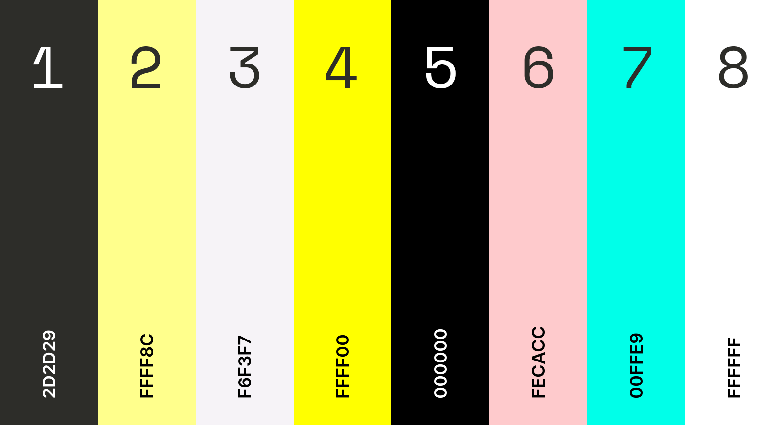
edrone primary colors:
- Tuatara / Jet — No. 1
- Neapolitan Yellow — No. 2
We use also:
- Ghost White — No. 3 — slightly dimmer version of white. Mostly for text backgrounds.
- Lemon Yellow; Black — No. 4 & 5 — when primary colors don’t make the desired impact. Also used for applying decorative watermarks.
And:
- Pastel Pink, Turquoise Blue — No. 6 & 7 — for addons, art-glitches, and a counterweight.
- White — No. 8 — Simple white when ghost-one is too boring.
Effect:
Summing Up
As you see, to work with onsite-marketing is not only about blinking banner with call to action.
There are no, and never will be, strict rules, regulating what you can and cannot do. There are some good advice’s telling what you should do and eventually the rules, how to think about it. It’s good to keep them in mind and to think like a client, connecting these two approaches.
And one last thing – test it. Test everything. As long as your clients like your page and love your communication, any other rule or good advice doesn’t apply!

Marcin Lewek
Marketing Manager
edrone
Digital marketer and copywriter experienced and specialized in AI, design, and digital marketing itself. Science, and holistic approach enthusiast, after-hours musician, and sometimes actor. LinkedIn
Do you want to increase sales and build even better relationships with your customers?